The Global Automotive & Mobility Innovation Challenge (GAMIC) accelerates mobility startups through competition, mentorship, and exposure to industry leaders. By 2024, the organization had built a strong reputation among insiders — but its outward brand presence hadn’t kept pace with the quality of its program or the caliber of its startups.
When GAMIC approached us, they weren’t looking for a simple website redesign. They needed a complete brand refresh — a cohesive identity and message that reflected their credibility, global reach, and long-standing impact in the mobility sector.
GAMIC’s communication and design elements had evolved organically over time. The result was a fragmented online presence: multiple domains, inconsistent visuals, and mixed messaging that varied depending on the audience. Even with impressive alumni results — over $2B in post-GAMIC investment — the story wasn’t being told in a way that captured the program’s value.
Our goal was to create a unified brand system and digital hub that:
Over several phases, we’ve guided GAMIC through a complete brand evolution — from early visual and logo redesigns to a full-scale brand and messaging refresh. Each stage built upon the last, ensuring the organization’s identity evolved in step with its expanding influence in the global mobility ecosystem.
Through a series of collaborative working sessions, we uncovered the central communication gap: GAMIC’s impact story wasn’t matching its visual and verbal presentation. We helped the leadership team distill the brand’s core promise — providing early-stage mobility startups with access, credibility, and opportunity.
We developed a unified messaging framework for all key audiences: startups, sponsors, partners, investors, members, alumni, and volunteers. This framework defined GAMIC’s tone, language, and brand personality — transforming how they talk about their mission and success stories. The refined messaging became the foundation for every piece of outward communication, from web copy to one-pagers. One of the core deliverables was a comprehensive 51-page Messaging Playbook, which established clear, audience-specific positioning and key message pillars for the organization. This document now serves as GAMIC’s reference guide for all communications, ensuring every piece of content — whether digital, print, or verbal — aligns with the refreshed brand voice.
The existing GAMIC site was functional but outdated, with inconsistent branding and scattered content. I led the creative direction on a complete visual refresh — modernizing the design system, introducing new typography and color hierarchy, and creating a cleaner, more intuitive user experience.
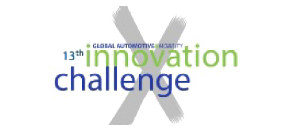
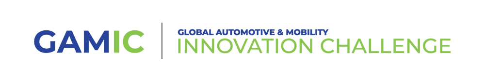
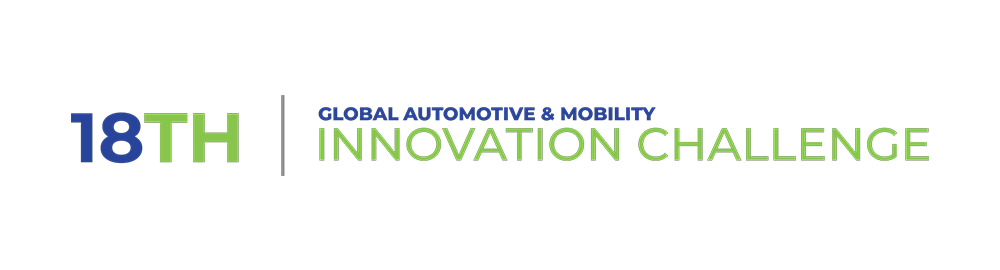
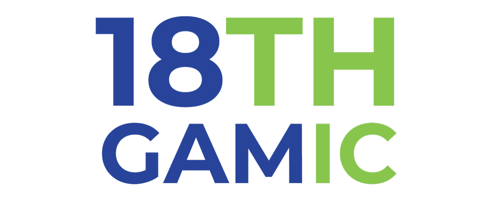
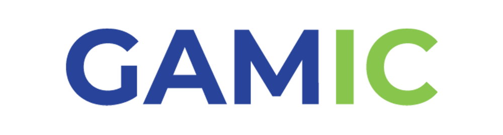
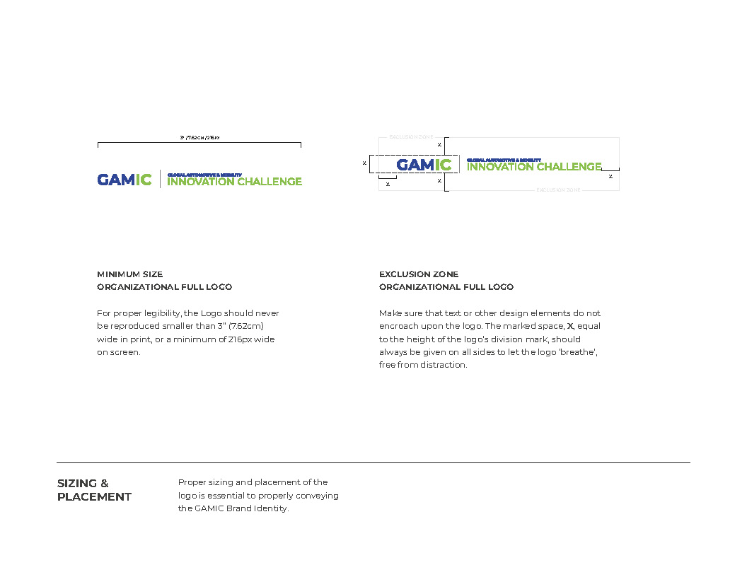
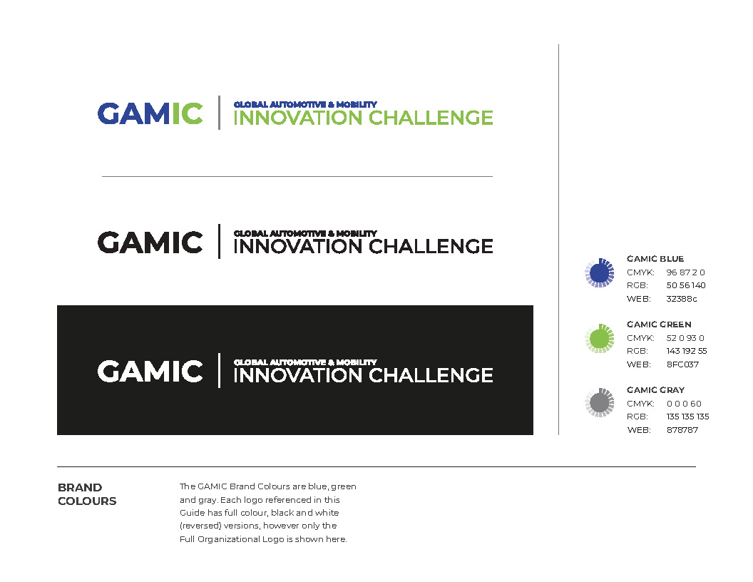
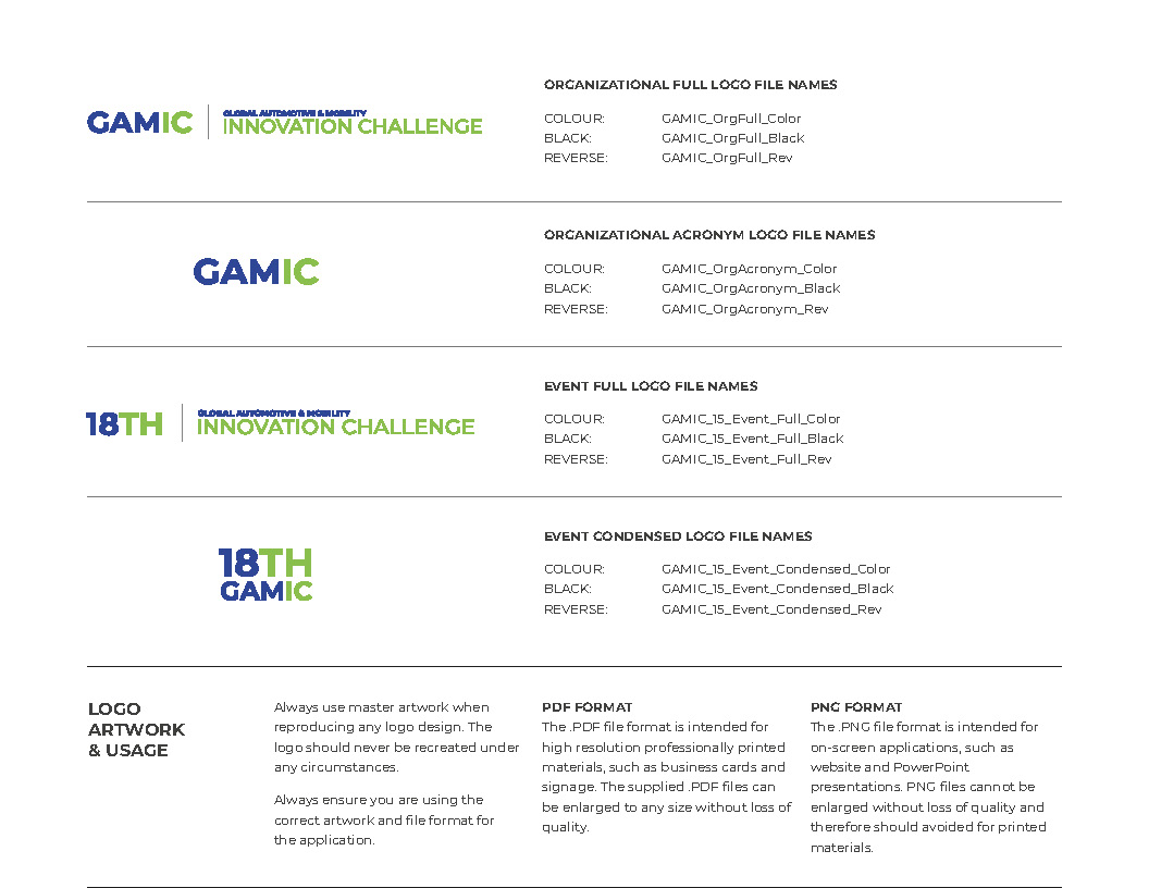
One of the most impactful elements of the refresh was the logo redesign. The previous logo was dated and overly complicated, which limited its legibility and versatility. We created a flexible logo system that includes a version for the corporate brand and a separate version for the annual event. The event logo incorporates the year number (for example, GAMIC 15, GAMIC 16, GAMIC 17, GAMIC 18) and is refreshed annually. Each version has long and short formats for use across marketing materials and merchandise, ensuring clarity and cohesion in every context.
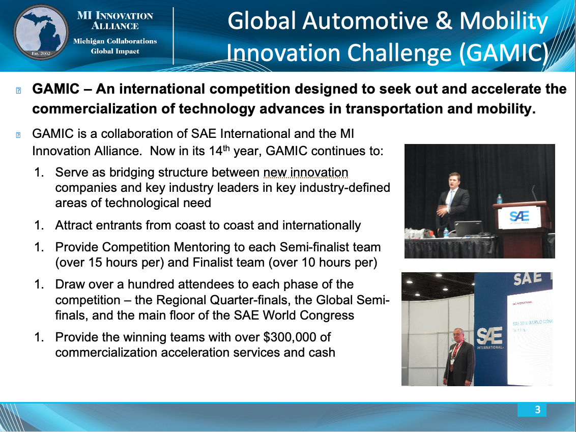
Because GAMIC’s image library was limited, we also opted for geometric patterns that convey movement, agility, innovation, and forward momentum — qualities that visually echo the spirit of emerging mobility startups.
We wrote entirely new content and built a site structure that’s easy to navigate, allowing visitors to quickly find information relevant to their needs. The result is a cohesive digital experience that reflects the organization’s credibility and energy
From fragmented and disjointed to unified and cohesive.
Original GAMIC Website
HOME PAGE
(Scroll down for full page)
COMPETITION OVERVIEW
(Scroll down for full page)
Redesigned GAMIC Website
HOME PAGE
(Scroll down for full page)
COMPETITION OVERVIEW
(Scroll down for full page)
o extend the new identity beyond the website, we created:
These assets ensure that every outward-facing communication — from competition decks to sponsorship proposals — reflects the refreshed brand with consistency and confidence.
The refreshed brand system reintroduced GAMIC to its global audience with clarity and authority. Every piece — from the website to the PowerPoint decks — now reinforces a cohesive narrative that mirrors the organization’s real-world impact.
While quantitative metrics are difficult to isolate, the qualitative outcomes are clear: GAMIC now communicates with the same professionalism and precision it delivers through its accelerator program. The team can confidently present itself to startups, sponsors, and industry leaders knowing their materials reflect the organization’s true value.
With the refreshed identity and website as its foundation, GAMIC is now positioned to expand its ecosystem — attracting new partners, investors, and high-potential startups from around the world. For us, the project demonstrates how strategic branding and message alignment can transform perception, create momentum, and support long-term growth.
Logo Redesign:
Showcasing the transformation from the previous, overly complex logo to the new flexible system that includes both corporate and annual event versions.
OLD GAMIC Logo
Redesigned GAMIC Logo
Logo Variations:
Examples of long and short formats of both corporate and annual event logos for use across marketing materials and merchandise.
GAMIC Full Corporate LOGO
GAMIC Full Annual Event Logo
GAMIC Condensed Annual Event Logo
GAMIC Condensed Organizational Logo